Lindsey Shepherd
About
Work
Launching College Board’s Design System
Product Design, College Board

Table of Contents
Overview
College Board, a nonprofit organization, leads programs such as the SAT and AP to help students broaden their opportunities and develop essential skills. Its technology division creates software to support students' needs.
With College Board shifting from traditional paper-based offerings to digital products, the need for a robust, centralized, and accessible design system became critical.
As a Product Designer on the Design Systems team, I played a key role in envisioning a system that empowered designers to work more efficiently and consistently as College Board developed software to better serve students.
Problem
- Inconsistent Visual Language: Products were using inconsistent colors, typography and iconography creating confusion for both users and designers making the brand feel disjointed.
- Fragmented Development Processes: There was no single source of truth for designers and developers, resulting in duplicated efforts and inconsistencies in implementation, which slowed down the delivery of new features.
- Lack of Scalability: The lack of a scalable design system made it difficult to onboard new team members efficiently and implement changes consistently across products.
- Increased Technical Debt: Previous design assets and components were built with little foresight of future use cases. This led to a buildup of technical debt, where updates or additions to the product often required significant time and effort to redesign.
Approach
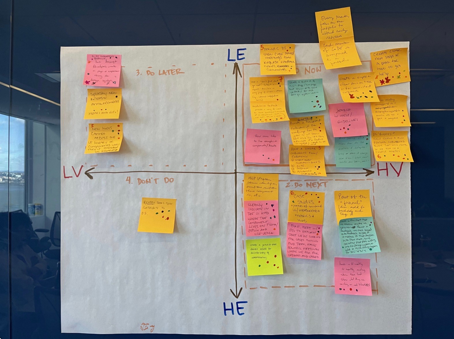
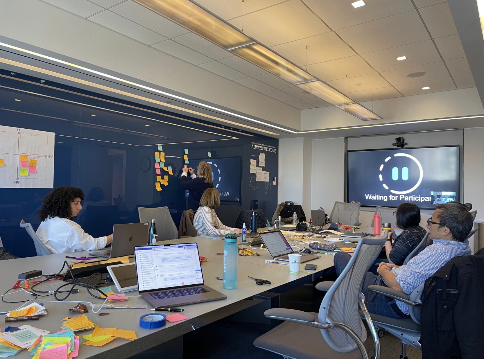
- Stakeholder Research & Discovery: The first step in the process was to conduct a series of interviews to better understand how designers and developers use the current tools, uncover any pain points, gather insights on team workflows.
- Audit of existing assets: The team conducted a thorough audit of the state of the current design system assets and identified common themes, areas of inconsistency and pinpointed areas of improvement.
- Defining Core Values: We conducted a workshop to define the following core values that would govern the reimagined design system:
- Consistency: Ensuring a unified visual identity.
- Scalability: Designing components that could scale across various products and devices.
- Accessibility: Designing with inclusive principles to ensure all users, regardless of ability, could interact with the products seamlessly.
- Flexibility: Allowing room for customizations while maintaining core guidelines.
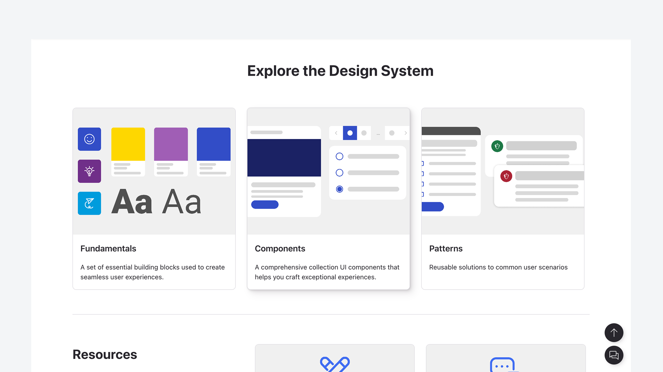
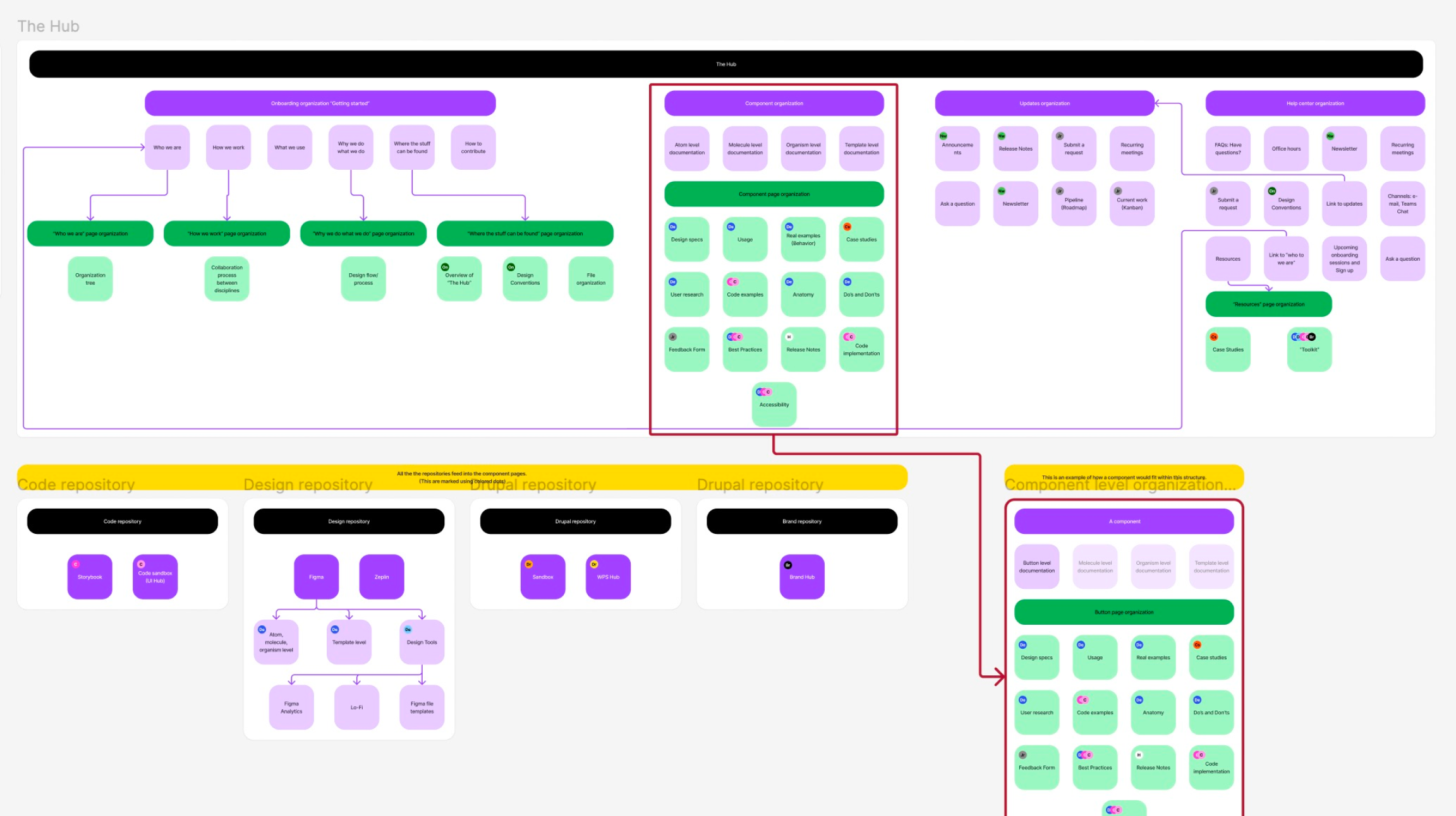
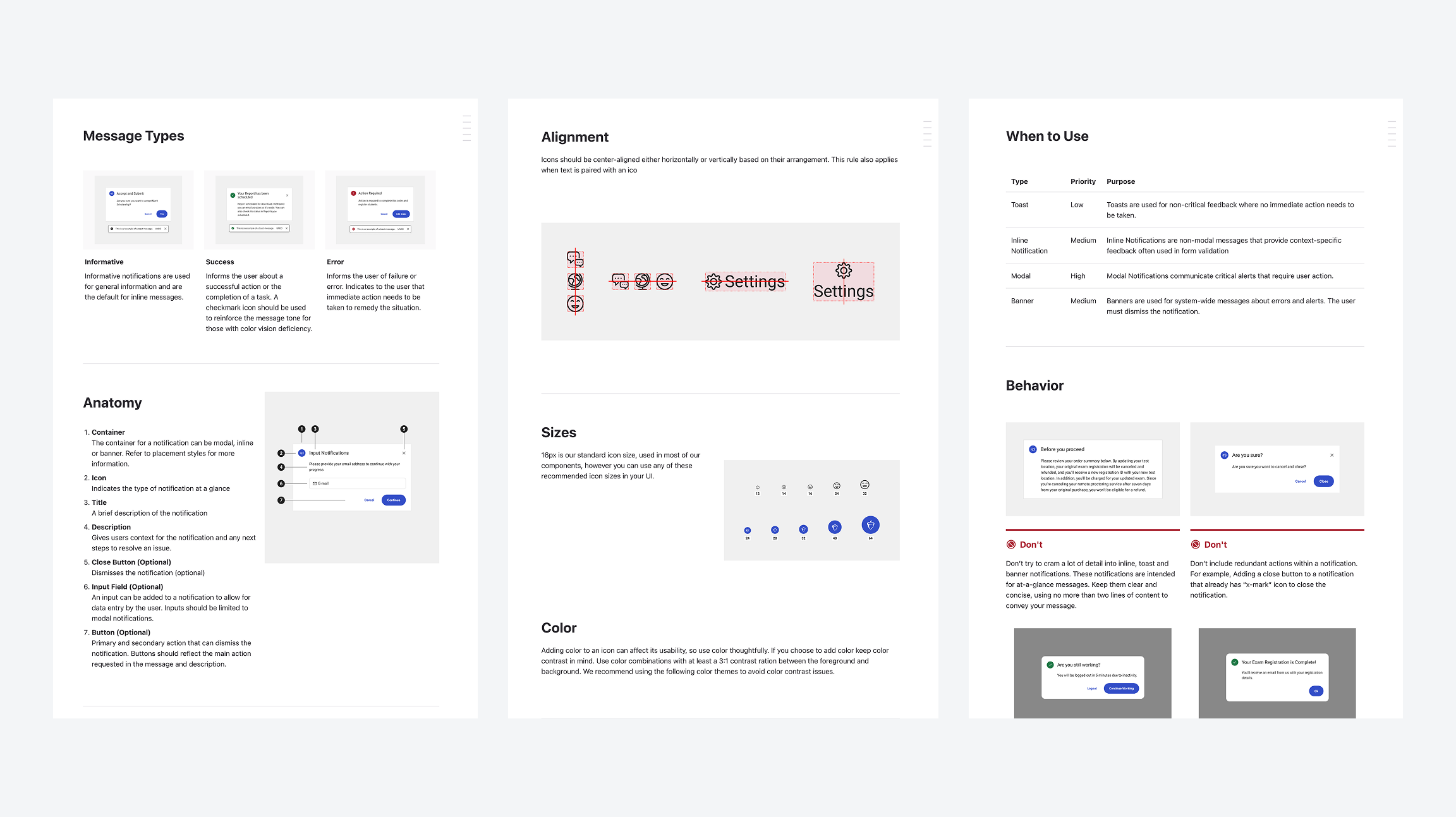
- Compiling Core Fundamentals and Components: The design team worked on compiling core components — type styles, colors, icons, form elements, buttons, accordions, modals, sliders —into a UI Kit for designers to easily integrate into products. These components followed a modular approach, allowing teams to combine them into more complex interfaces.
- Collaboration with Developers: The use of version-controlled repositories for components were set up to ensure that both design and development teams had access to the same resources and could track updates seamlessly.
- Documentation and Guidelines: One of the most critical components of the LunchBox design system was comprehensive documentation. This included:
- Design principles and best practices for consistency across teams.
- Component usage guidelines to ensure designers and developers understood how to implement each component correctly.
- Accessibility guidelines to promote inclusive design practices.
- Code snippets and Figma designs to provide both developers and designers with ready-to-integrate assets.
- Feedback and Iteration: After the initial rollout, the team sought feedback from both internal stakeholders and end-users. Continuous iteration and user testing allowed the team to refine the design system and meet user needs.
Results
- Increased Consistency: The LunchBox design system created a consistent and unified visual language across all products. This helped improve brand recognition and user trust, as the user interface now felt cohesive and intuitive across all touchpoints.
- Improved Efficiency: With reusable components and a centralized library of assets, both designers and developers saw significant improvements in efficiency. The time required to design new features decreased by 30%, and the development cycle was shortened by 25%.
- Better Collaboration: The close collaboration between design, development, and product teams led to smoother workflows and better communication. Regular updates and access to the design system documentation ensured that everyone was on the same page.
- Scalability and Future-Proofing: The new design system was able to support the company’s growth and scale with ease. As the company introduced new products and features, the design system could easily accommodate new components, ensuring that the entire product suite remained consistent.
- Reduced Technical Debt: The revamped design system eliminated much of the technical debt accumulated over the years. By having a standardized set of components and guidelines, updates and feature additions became less time-consuming, reducing long-term maintenance costs.
- Positive User Feedback: The improvements in design consistency and accessibility resulted in a better user experience. Users reported an easier and more intuitive interface, contributing to a 15% increase in customer satisfaction as measured by user surveys and feedback.
Lindsey Shepherd
Admissions Viewbook
Visual Design and Marketing
Knowledge and Skills Domain
Logo Design
About
Resume
Contact
Lindsey Shepherd
About
Work
Launching College Board’s Design System
Product Design, College Board
Table of Contents
Overview
College Board, a nonprofit organization, leads programs such as the SAT and AP to help students broaden their opportunities and develop essential skills. Its technology division creates software to support students' needs.
With College Board shifting from traditional paper-based offerings to digital products, the need for a robust, centralized, and accessible design system became critical.
As a Product Designer on the Design Systems team, I played a key role in envisioning a system that empowered designers to work more efficiently and consistently as College Board developed software to better serve students.
Problem
- Inconsistent Visual Language: Products were using inconsistent colors, typography and iconography creating confusion for both users and designers making the brand feel disjointed.
- Fragmented Development Processes: There was no single source of truth for designers and developers, resulting in duplicated efforts and inconsistencies in implementation, which slowed down the delivery of new features.
- Lack of Scalability: The lack of a scalable design system made it difficult to onboard new team members efficiently and implement changes consistently across products.
- Increased Technical Debt: Previous design assets and components were built with little foresight of future use cases. This led to a buildup of technical debt, where updates or additions to the product often required significant time and effort to redesign.
Approach
- Stakeholder Research & Discovery: The first step in the process was to conduct a series of interviews to better understand how designers and developers use the current tools, uncover any pain points, gather insights on team workflows.
- Audit of existing assets: The team conducted a thorough audit of the state of the current design system assets and identified common themes, areas of inconsistency and pinpointed areas of improvement.
- Defining Core Values: We conducted a workshop to define the following core values that would govern the reimagined design system:
- Consistency: Ensuring a unified visual identity.
- Scalability: Designing components that could scale across various products and devices.
- Accessibility: Designing with inclusive principles to ensure all users, regardless of ability, could interact with the products seamlessly.
- Flexibility: Allowing room for customizations while maintaining core guidelines.
- Compiling Core Fundamentals and Components: The design team worked on compiling core components — type styles, colors, icons, form elements, buttons, accordions, modals, sliders —into a UI Kit for designers to easily integrate into products. These components followed a modular approach, allowing teams to combine them into more complex interfaces.
- Collaboration with Developers: The use of version-controlled repositories for components were set up to ensure that both design and development teams had access to the same resources and could track updates seamlessly.
- Documentation and Guidelines: One of the most critical components of the LunchBox design system was comprehensive documentation. This included:
- Design principles and best practices for consistency across teams.
- Component usage guidelines to ensure designers and developers understood how to implement each component correctly.
- Accessibility guidelines to promote inclusive design practices.
- Code snippets and Figma designs to provide both developers and designers with ready-to-integrate assets.
- Feedback and Iteration: After the initial rollout, the team sought feedback from both internal stakeholders and end-users. Continuous iteration and user testing allowed the team to refine the design system and meet user needs.
Results
- Increased Consistency: The LunchBox design system created a consistent and unified visual language across all products. This helped improve brand recognition and user trust, as the user interface now felt cohesive and intuitive across all touchpoints.
- Improved Efficiency: With reusable components and a centralized library of assets, both designers and developers saw significant improvements in efficiency. The time required to design new features decreased by 30%, and the development cycle was shortened by 25%.
- Better Collaboration: The close collaboration between design, development, and product teams led to smoother workflows and better communication. Regular updates and access to the design system documentation ensured that everyone was on the same page.
- Scalability and Future-Proofing: The new design system was able to support the company’s growth and scale with ease. As the company introduced new products and features, the design system could easily accommodate new components, ensuring that the entire product suite remained consistent.
- Reduced Technical Debt: The revamped design system eliminated much of the technical debt accumulated over the years. By having a standardized set of components and guidelines, updates and feature additions became less time-consuming, reducing long-term maintenance costs.
- Positive User Feedback: The improvements in design consistency and accessibility resulted in a better user experience. Users reported an easier and more intuitive interface, contributing to a 15% increase in customer satisfaction as measured by user surveys and feedback.
Lindsey Shepherd
About
Work
Launching College Board’s Design System
Product Design, College Board
Table of Contents
Overview
College Board, a nonprofit organization, leads programs such as the SAT and AP to help students broaden their opportunities and develop essential skills. Its technology division creates software to support students' needs.
With College Board shifting from traditional paper-based offerings to digital products, the need for a robust, centralized, and accessible design system became critical.
As a Product Designer on the Design Systems team, I played a key role in envisioning a system that empowered designers to work more efficiently and consistently as College Board developed software to better serve students.
Problem
- Inconsistent Visual Language: Products were using inconsistent colors, typography and iconography creating confusion for both users and designers making the brand feel disjointed.
- Fragmented Development Processes: There was no single source of truth for designers and developers, resulting in duplicated efforts and inconsistencies in implementation, which slowed down the delivery of new features.
- Lack of Scalability: The lack of a scalable design system made it difficult to onboard new team members efficiently and implement changes consistently across products.
- Increased Technical Debt: Previous design assets and components were built with little foresight of future use cases. This led to a buildup of technical debt, where updates or additions to the product often required significant time and effort to redesign.
Approach
- Stakeholder Research & Discovery: The first step in the process was to conduct a series of interviews to better understand how designers and developers use the current tools, uncover any pain points, gather insights on team workflows.
- Audit of existing assets: The team conducted a thorough audit of the state of the current design system assets and identified common themes, areas of inconsistency and pinpointed areas of improvement.
- Defining Core Values: We conducted a workshop to define the following core values that would govern the reimagined design system:
- Consistency: Ensuring a unified visual identity.
- Scalability: Designing components that could scale across various products and devices.
- Accessibility: Designing with inclusive principles to ensure all users, regardless of ability, could interact with the products seamlessly.
- Flexibility: Allowing room for customizations while maintaining core guidelines.
- Compiling Core Fundamentals and Components: The design team worked on compiling core components — type styles, colors, icons, form elements, buttons, accordions, modals, sliders —into a UI Kit for designers to easily integrate into products. These components followed a modular approach, allowing teams to combine them into more complex interfaces.
- Collaboration with Developers: The use of version-controlled repositories for components were set up to ensure that both design and development teams had access to the same resources and could track updates seamlessly.
- Documentation and Guidelines: One of the most critical components of the LunchBox design system was comprehensive documentation. This included:
- Design principles and best practices for consistency across teams.
- Component usage guidelines to ensure designers and developers understood how to implement each component correctly.
- Accessibility guidelines to promote inclusive design practices.
- Code snippets and Figma designs to provide both developers and designers with ready-to-integrate assets.
- Feedback and Iteration: After the initial rollout, the team sought feedback from both internal stakeholders and end-users. Continuous iteration and user testing allowed the team to refine the design system and meet user needs.
Results
- Increased Consistency: The LunchBox design system created a consistent and unified visual language across all products. This helped improve brand recognition and user trust, as the user interface now felt cohesive and intuitive across all touchpoints.
- Improved Efficiency: With reusable components and a centralized library of assets, both designers and developers saw significant improvements in efficiency. The time required to design new features decreased by 30%, and the development cycle was shortened by 25%.
- Better Collaboration: The close collaboration between design, development, and product teams led to smoother workflows and better communication. Regular updates and access to the design system documentation ensured that everyone was on the same page.
- Scalability and Future-Proofing: The new design system was able to support the company’s growth and scale with ease. As the company introduced new products and features, the design system could easily accommodate new components, ensuring that the entire product suite remained consistent.
- Reduced Technical Debt: The revamped design system eliminated much of the technical debt accumulated over the years. By having a standardized set of components and guidelines, updates and feature additions became less time-consuming, reducing long-term maintenance costs.
- Positive User Feedback: The improvements in design consistency and accessibility resulted in a better user experience. Users reported an easier and more intuitive interface, contributing to a 15% increase in customer satisfaction as measured by user surveys and feedback.